steve’s organics
Individual Concept Project | Website | 2 Week Sprint
The Brief
“Steve’s Organics,” a fictitious neighbourhood grocer, aimed to expand with a new e-commerce website that is easy to use and navigate while maintaining the store’s “small shop” appeal. I was given a brief with the following considerations:
Store’s Brand
Community Focused: Employs local staff and supports the community.
Service-First: Expert advice, seamless order to delivery experience, and sourcing hard-to-find items.
Hand-Picked Selection: Curated products chosen for quality over quantity
Personal Touch: Maintain the feel of a neighbourhood shop despite online growth.
E-Commerce Functionality
Clear ways of locating specific products
Single page for each product, linkable directly
Efficient means of purchasing products
Must
Establish the brand and its unique points
Steer customers towards popular products
Allow customer contact (including product requests)
understanding users
Contextual Inquiry
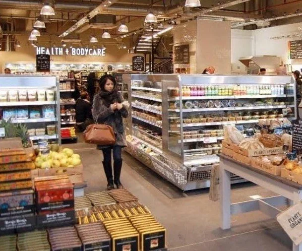
I observed and interviewed shoppers at a local Planet Organic. Key findings included:
Shoppers came for specific products but enjoyed browsing due to easy navigation and product variety.
Preferred in-person shopping for the browsing experience and store environment.
Saw Planet Organic as a rare find for specialised products.
Cost was a concern for specialised health products.
defining the problem
The website would be targeting the users of specialised food product customers who identify with Steve’s community, but can't visit regularly.
How might we provide users an easy way to find, purchase, and schedule delivery of specialised products online, while preserving the in-store browsing experience?
Navigation and Site structure
Easy navigation was crucial, both for users to easily perform tasks and to emulate the experience of in-store browsing.
information architecture
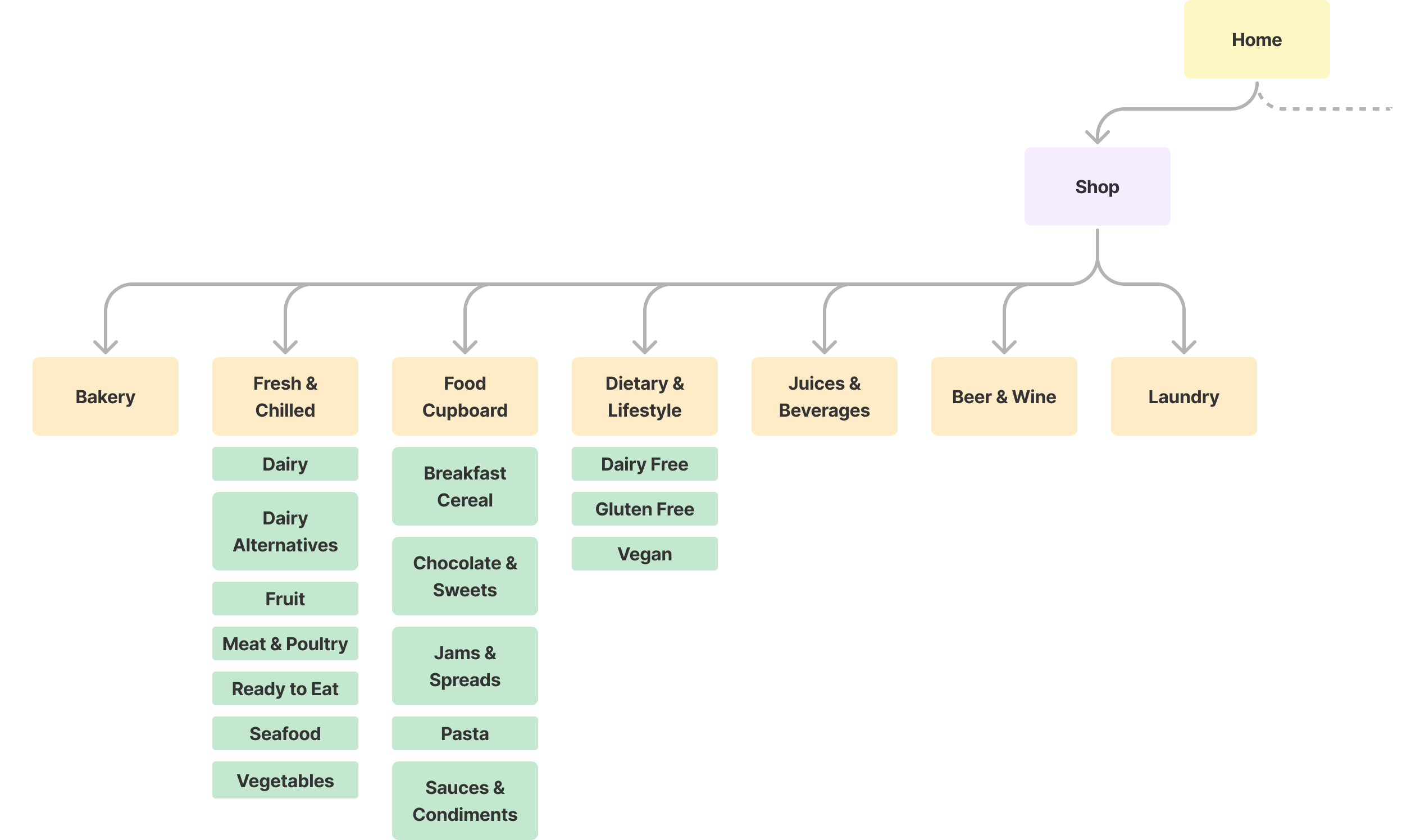
I conducted an open card sort for the 73 products in Steve’s inventory and cross-referenced results with broader online shopping categories from Planet Organic, Ocado, and Waitrose so that users could easily find the products they needed.
Results of one Card Sort
Steves’ Shopping Categories
Competitive Analysis
I also analysed other grocery websites offering delivery to understand common mental models for site navigation, purchasing, and scheduling delivery.
prototyping and testing
First Prototype
The first prototype focused on:
Intuitive product search, cart addition, purchase, and delivery scheduling
Showcasing product promotions on the homepage to mimic in-store browsing
Header navigation links for business info, contact, and product requests
what tested well
Navigation: Users found it easy to navigate and browse products.
Ordering: Placing orders fit existing mental models of users who found the process seamless and easy.
what needed improvement
Users were under he impression that Steve’s Organics was a “chain” grocer, rather than a small independent business with close ties to its local community.
Establishing the brand’s points of difference was emphasised in the brief, so I revisited the design to understand how this could be communicated more clearly.
refining
Broadening Competitive ANALYSIS
I analysed websites of companies that successfully communicated similar values to users. A helpful comparison was vegetable box delivery services, which highlight relationships with local farmers and distributors.
SECOND ITERATION
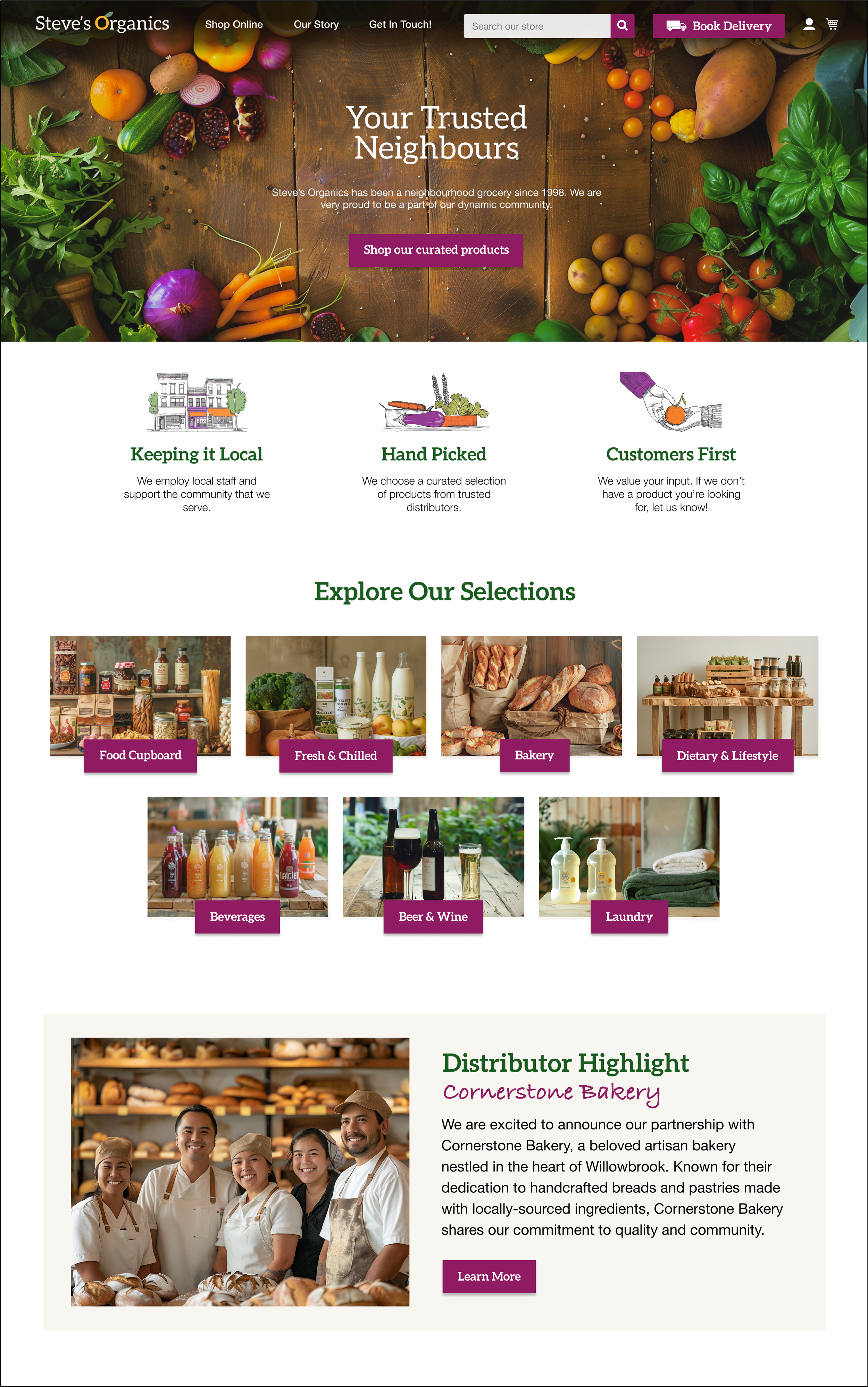
Homepage Storytelling: Added a section highlighting the story of Steve’s Organics, its origins, and community involvement.
Personal Touch on Product Pages: Each product page featured a “Handpicked by Steve” section with Steve’s photo and product descriptions.
Community Engagement: Introduced customer testimonials and a blog with updates from Steve about new products, farmer partnerships, and store events.
SUCCESSFUL TESTING OF THE SECOND ITERATION
The revised prototype was tested with more users, yielding positive results:
Local Identity: Users recognized and appreciated the store’s local, community-focused identity.
Personal Touch: The “Handpicked by Steve” feature fostered a stronger connection with the store.
Usability: Navigation and ordering process remained user-friendly.
Takeaways
This project highlighted the importance of understanding and addressing user needs while staying true to the brand’s unique identity.
Storytelling Matters: A brand narrative significantly impacts user perception, especially for small businesses.
Balancing Functionality and Branding: Successfully balancing usability with authentic branding enhances user experience and loyalty.


