
kitchen cupboard
Individual Concept Project | Native Mobile App | 2 Week Sprint
The Brief
In this project, I designed an app specifically for an individual named Katie who loves all things food related. Over the course of a week, I explored ways to optimise her specific meal preparation routine so that she could focus more on the joy she finds in cooking and less on her anxieties of wasting food.
Read the extended case study on Medium.

Discovery Phase
Getting to Know Katie
I conducted a user interview with Katie, who talked about her love for cooking. She told me about the way she plans and prepares her weeknight dinners. I asked her to walk me through this routine step by step and created a user journey map to locate any pain points that could be improved upon.
Katie’s Evening Routine
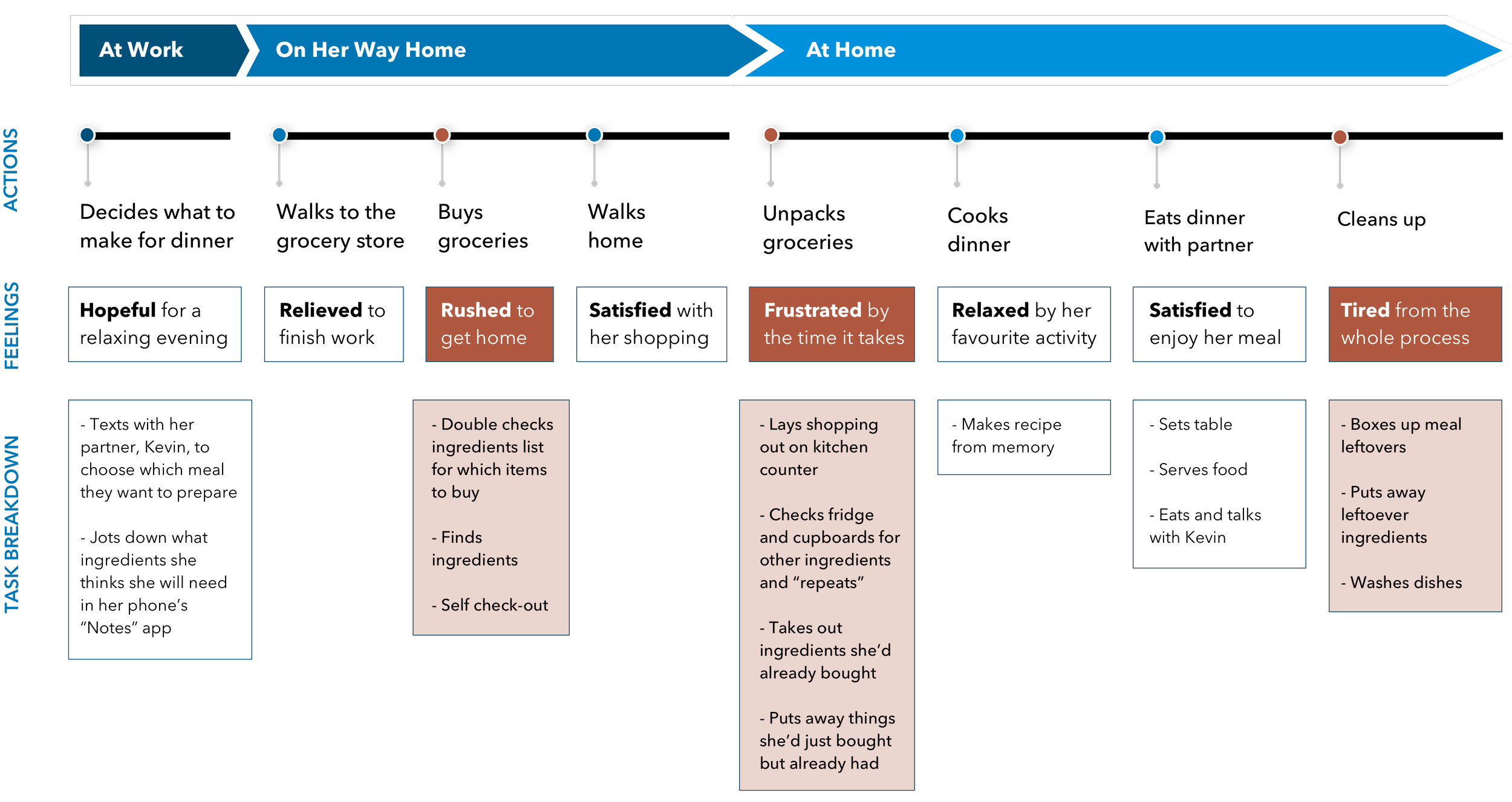

Defining the Problem
Katie explained to me that she only ever goes to the grocery store on her way home from work to pick up specific ingredients for that night’s dinner that she guesses she needs from memory.
She never makes a “grocery run” to stock up on items she is low on.

Since Katie’s memory is unreliable, she often buys ingredients that she forgot she already had.
Katie cares about reducing food waste, so she is then tasked with the time consuming process of organising her fridge and cupboards to make sure she uses the oldest ingredients first so nothing expires.
The job to be done
Katie needed a way to know exactly which groceries to buy because she wanted to keep stock of just the right quantity of food.

Developing Ideas

ideation
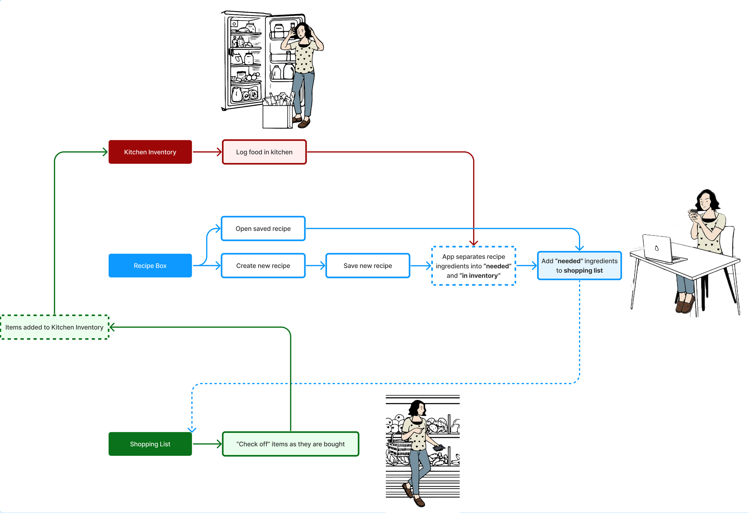
I considered the typical mental model behind “shopping lists,” which tell a user what they need more of. A user adds items to this list to reference when shopping since they can’t keep it in their memory.
However, Katie needed to know what she didn’t need more of. Her problem was not being able to keep a kitchen inventory in her memory while shopping. I reversed the “shopping list” model so that she would remove an item from that inventory when she ran out of it.
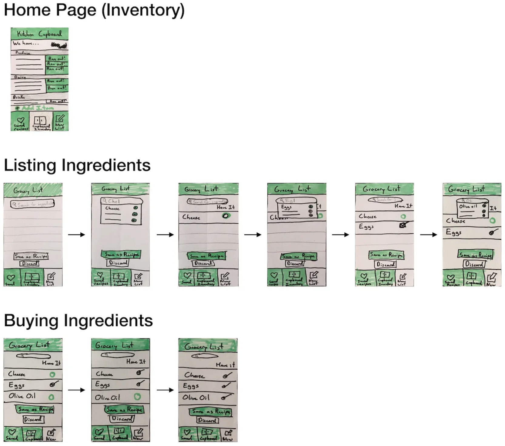
Paper prototype
For the paper prototype that I would be using in my first round of user tests, I focused on the screens that Katie would see during her weekday routine when she buys ingredients for a recipe.
To simplify the task for testing, she would be making an omelet and know that she needed cheese, eggs, and olive oil. She would discover while using the app that she already had eggs at home.

refining
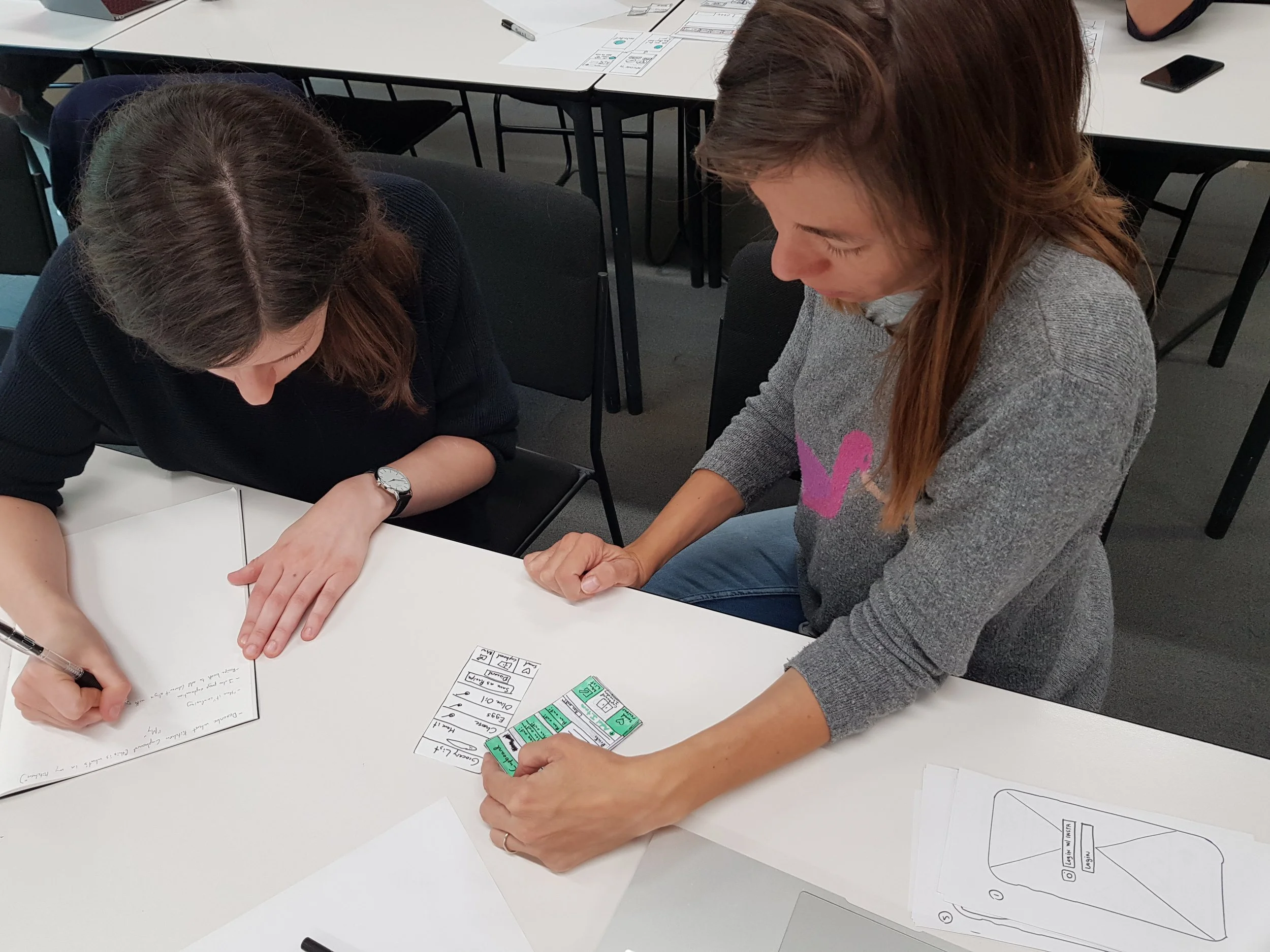
user testing
I gave the paper prototype to users and placed them in a scenario where they would perform the following actions:
They are planning to stop by the grocery store on the way home from work and list the ingredients that they need for an omelet they are making the next morning.
After the app has told them which ingredients they already have, they buy the ones that they still need and mark them as “stocked.”
Misleading check boxes
When an item was added to the ingredient shopping list, it would have a “check box” next to it. The box would already be checked if the item was in the user’s inventory.
Users found the list with mixed checked and unchecked boxes to be confusing. One user said that she felt prompted to “un-check” checked boxes.
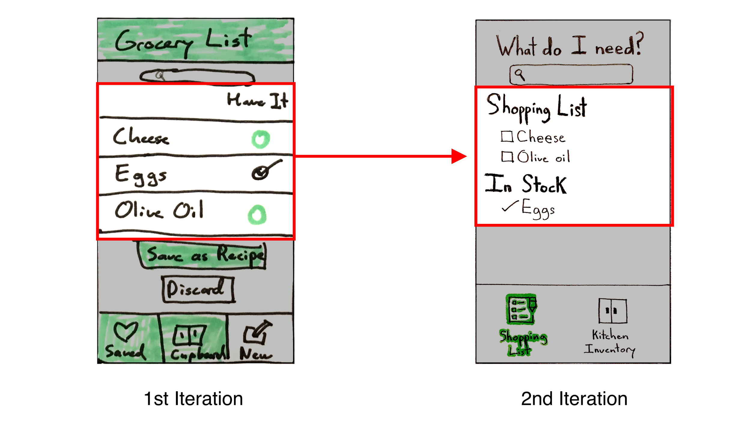
In the second iteration, I had the ingredients separated into two different lists based on whether or not the item was stocked. This way, users were able to focus on what they needed to buy under “Shopping List.” I also had the check next to stocked items appear on its own instead of inside a box so that it appeared fixed.
Clarity of App Sections
In order for the tasks to be more intuitive, the sections of the app that had emerged in the process would need to be made clear to users in onboarding. I created a user flow to distinguish between the functions of the kitchen inventory, recipe box, and shopping list.

DELIVERY
When moving into digital high fidelity, I emphasised carrying over the clarity of separate lists and categories, which tested positively with users’ ease of navigation.
recipe box
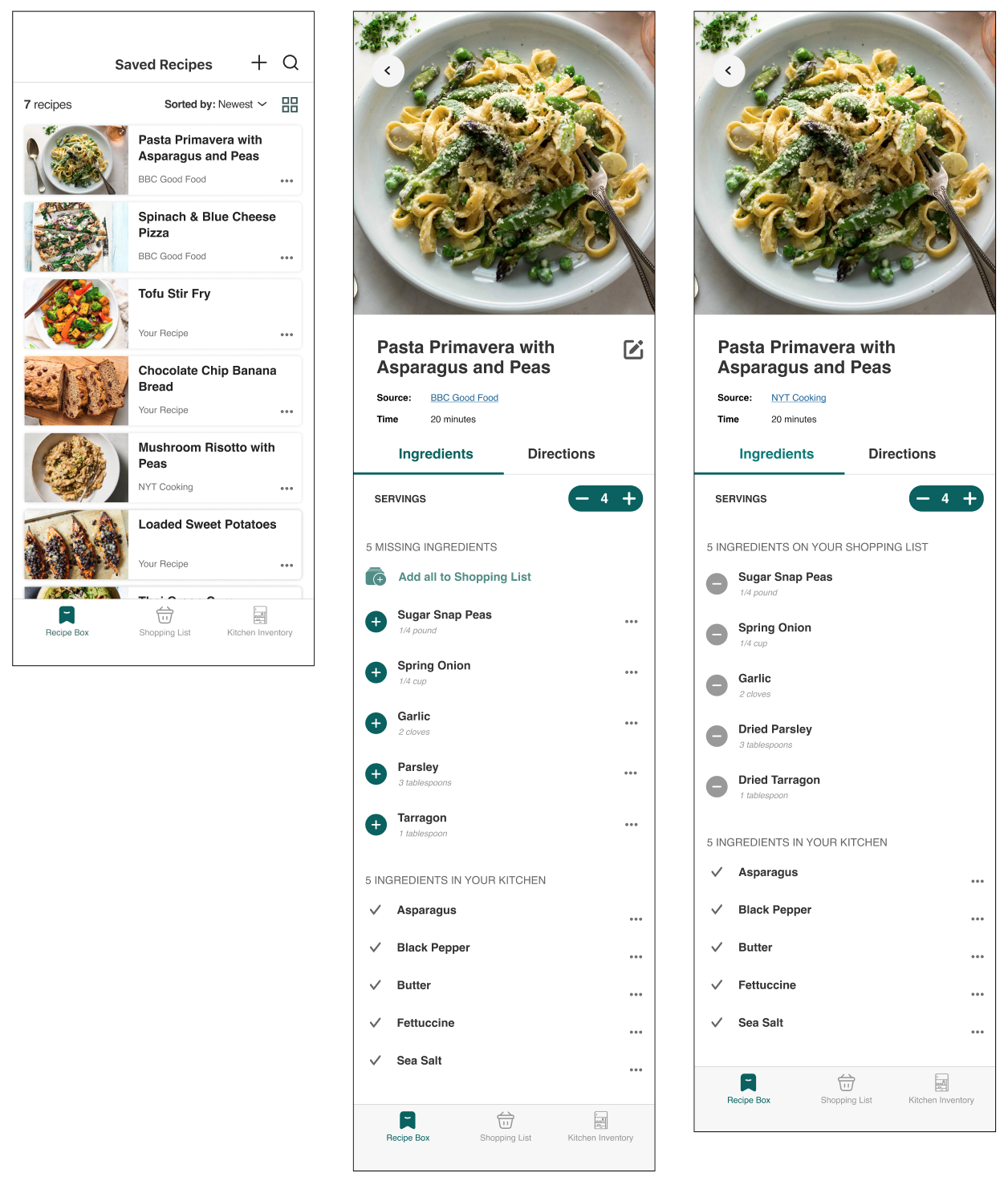
Recipe menu and recipe ingredient list before and after ingredients have been added to shopping list
Shopping List
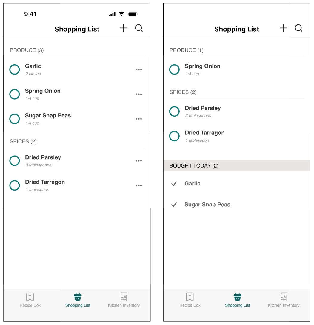
Before and after items have been purchased, with “bought today” to keep track.
Kitchen Inventory
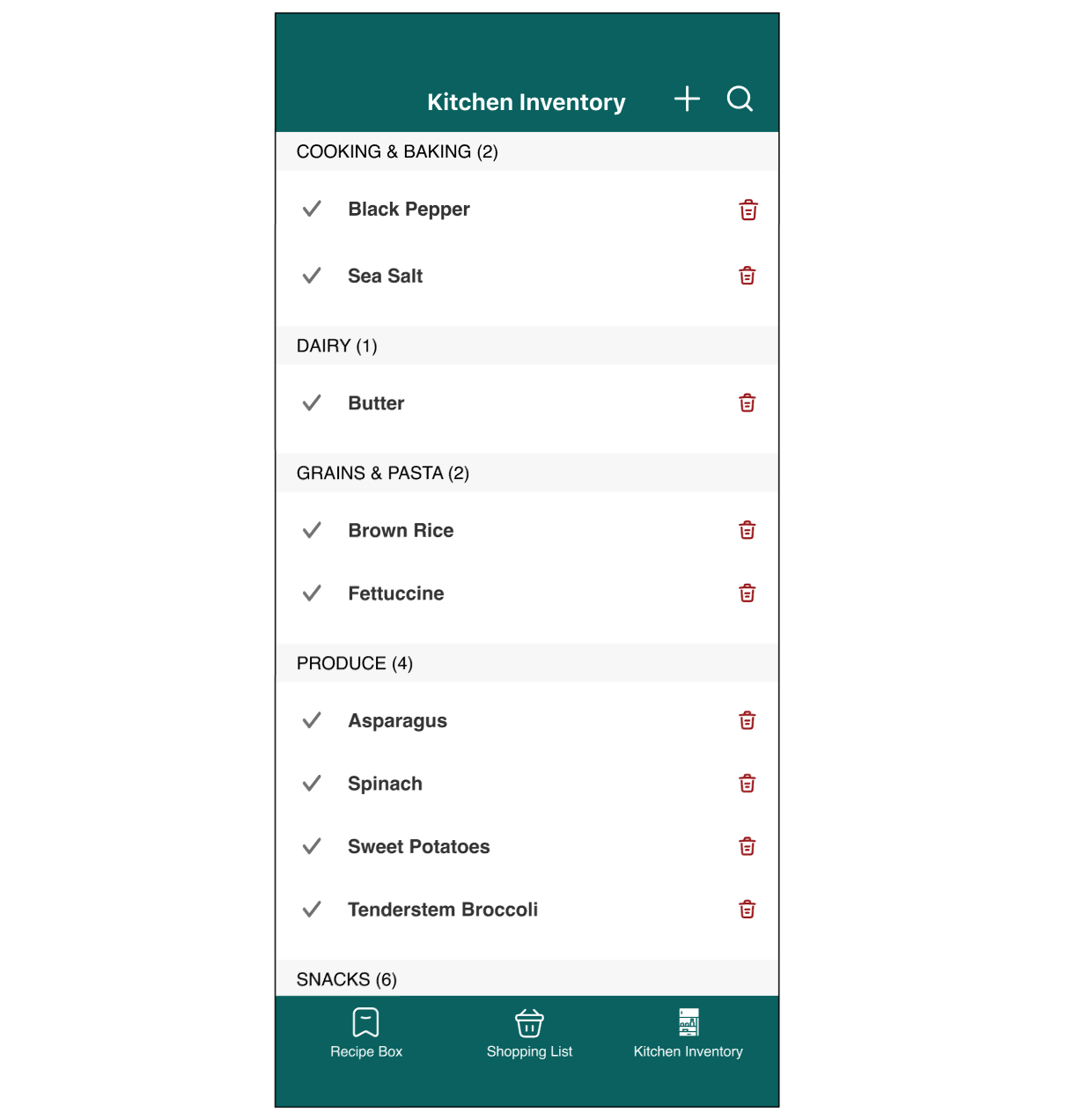
Items are represented as static so as not to confuse with shopping list, but can be deleted when updating inventory. Colour scheme is inverted to distinctly set section apart.