Compare ethics
Group Project | Mobile-First Website | 2.5 Week Design Sprint
A UK survey conducted by the retailer Clothes2Order found that:
50% of UK consumers have at least once researched a brand’s ethical policies before making a purchase.
44% will avoid buying from a brand that they deem unethical.
But while consumers want to factor ethics into their purchasing decisions, they often abandon their efforts because of the time and energy it takes to sift through information about companies and how ethical practices work.
The Client
This is where Compare Ethics can help shoppers.
Compare Ethics is a brand aggregator that helps shoppers find verified ethically made products.
Brands go through a verification process and the website “rates” them based on how their policies affect the environment, workers, and animal welfare.
The Brief
My team and I took a user-centered approach to make design changes that would more effectively:
Help users understand the site’s ranking system.
Present a product’s ethical practices information that users cared about in a way that was easy to digest.
Optimise navigation between Compare Ethics and external sites that it showcased products from.
discovery phase
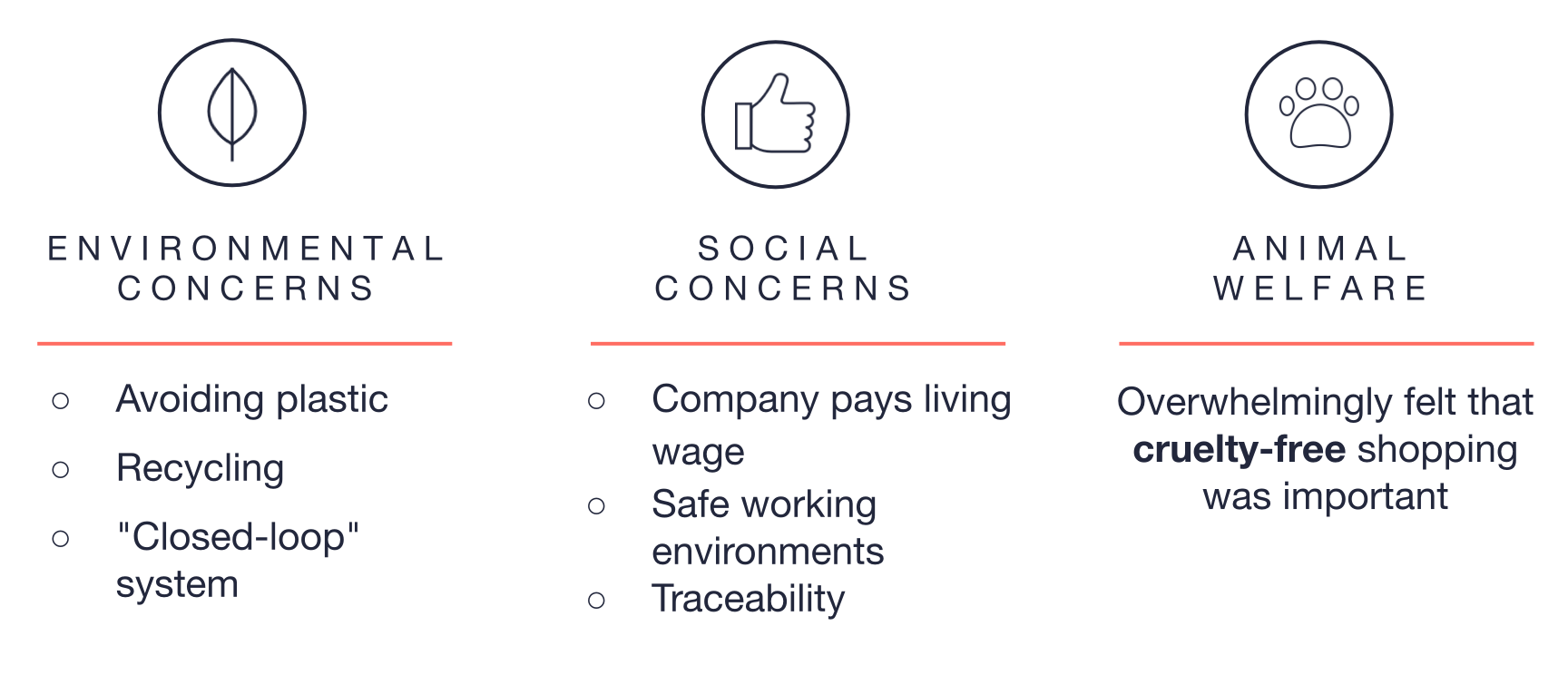
users cared about…
User Research
We conducted a survey and user interviews that reflected the demographics of visitors to the website. We wanted to understand:
Their current process in researching companies and their ethical practices before making purchases
Which ethical practices they cared most about
Our findings on online shopping habits were that
The majority of users finalise web purchases on their computers, rather than their smartphones.
Clothing e-commerce ease of navigation and customisable results created the best online shopping experience
We also learned that the biggest obstacles to shopping ethically and sustainably were:
Lack of availability of information about sustainability in the fashion industry
Lack of trust in information that is available about a company’s practices
Cost of products that are ethically made
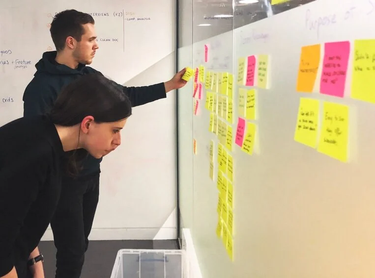
testing the current website
We tested the existing website both on desktop and mobile to learn, primarily, what was preventing users from making the full journey from Compare Ethics to external websites where they could buy the products they had learned about.
The results were consistent across both platforms: Users tended to be unaware that Compare Ethics was an aggregator and assume that it was an e-commerce site where they could buy the products directly.
The experience of making the discover was confusing and frustrating.
defining the problem
We synthesised our findings into a persona who would be representative of customers’ needs and motivations.
Looking at the pain points in Melissa’s user journey on the site, we felt we had two main pain points to address in order to improve her experience:
How might we present the ethical score and specs of products in a way that is clear, informative, and trustworthy to consumers?
How might we help users understand the “aggregator functionality” of Compare Ethics so that they don’t feel misled and can instead use it as a helpful tool?
Developing Ideas
Aggregator Functionality
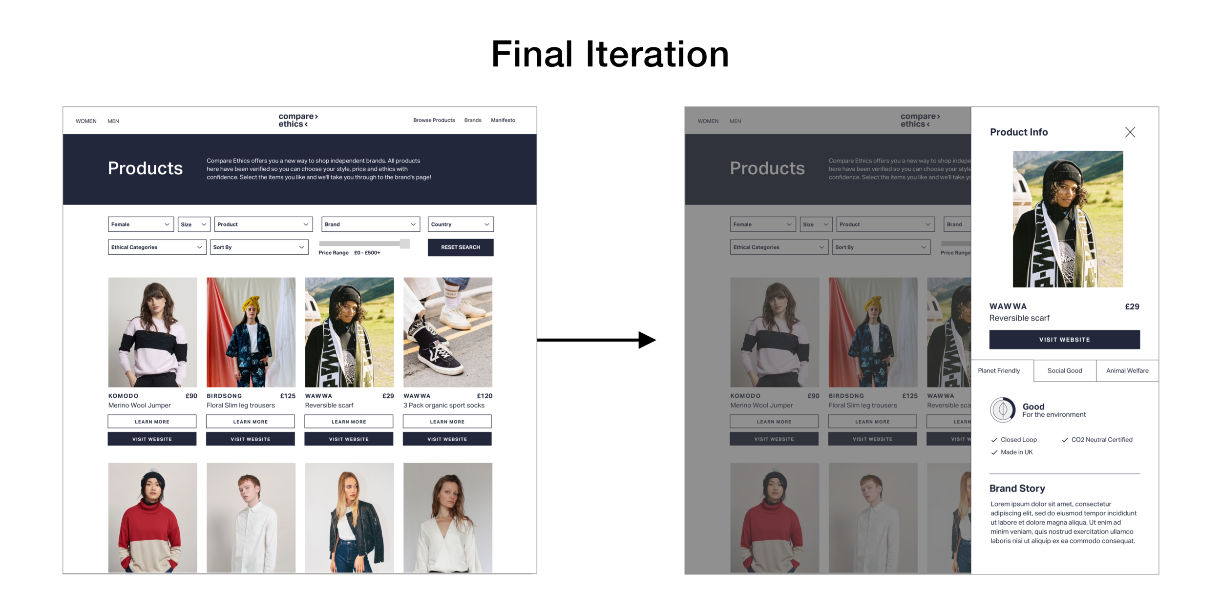
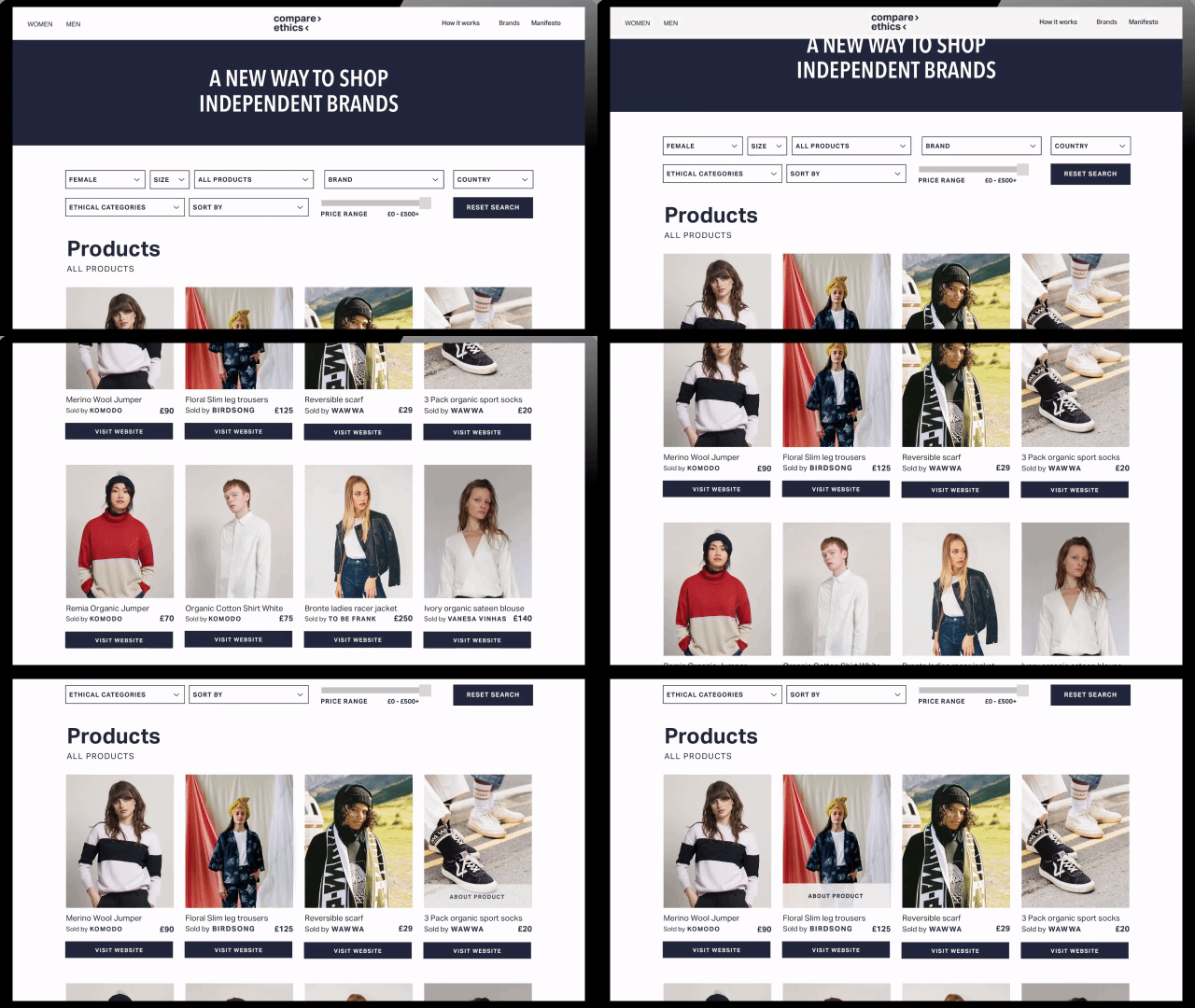
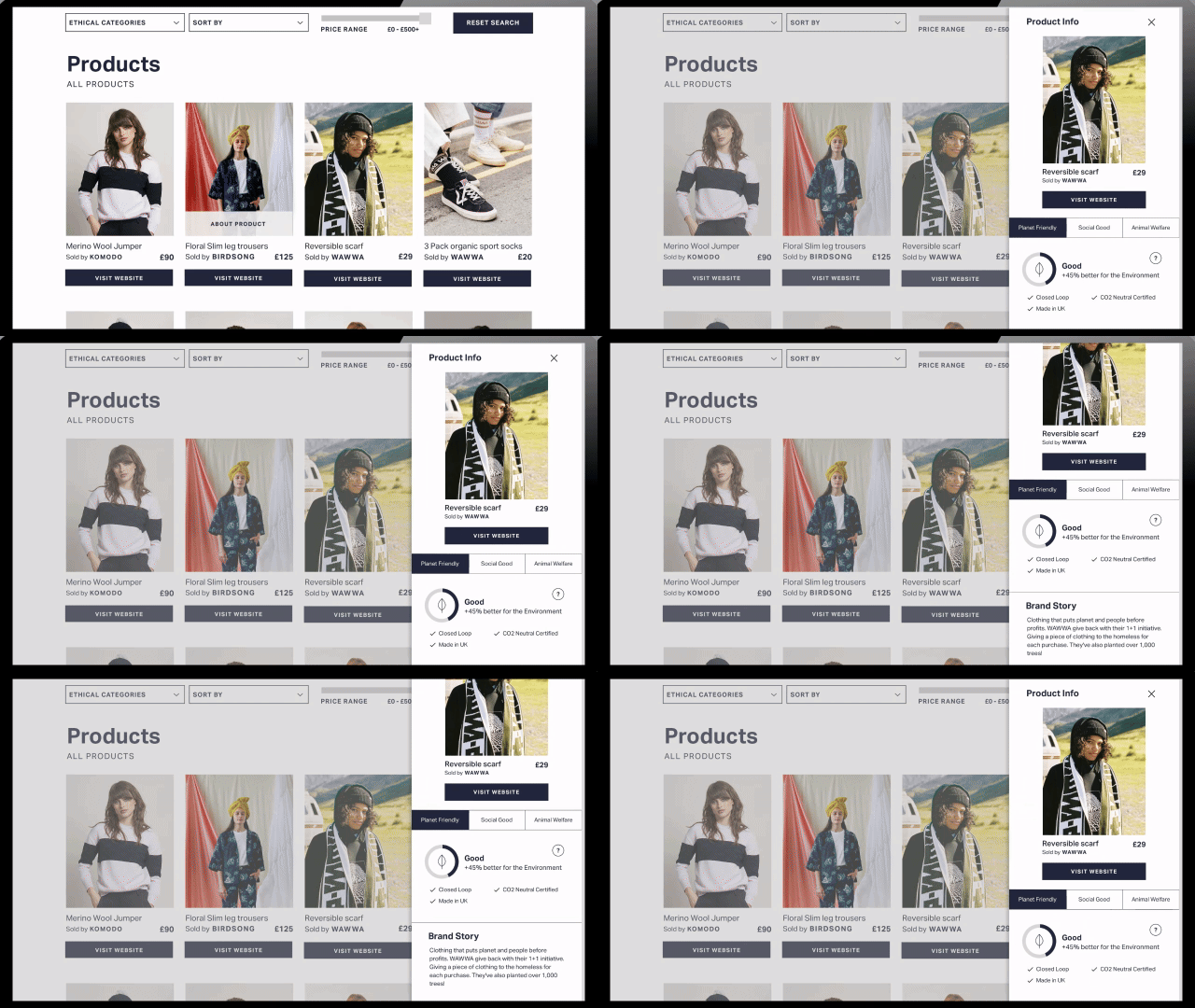
In a design studio with our client, we came up with the idea to present the “product stories” in a pop-up or slide-out to create a step between learning information about the product and visiting the external website to buy it.
Since we were designing with mobile in mind, we had the “slide-out” in a vertical bar which would also fit on a mobile screen.
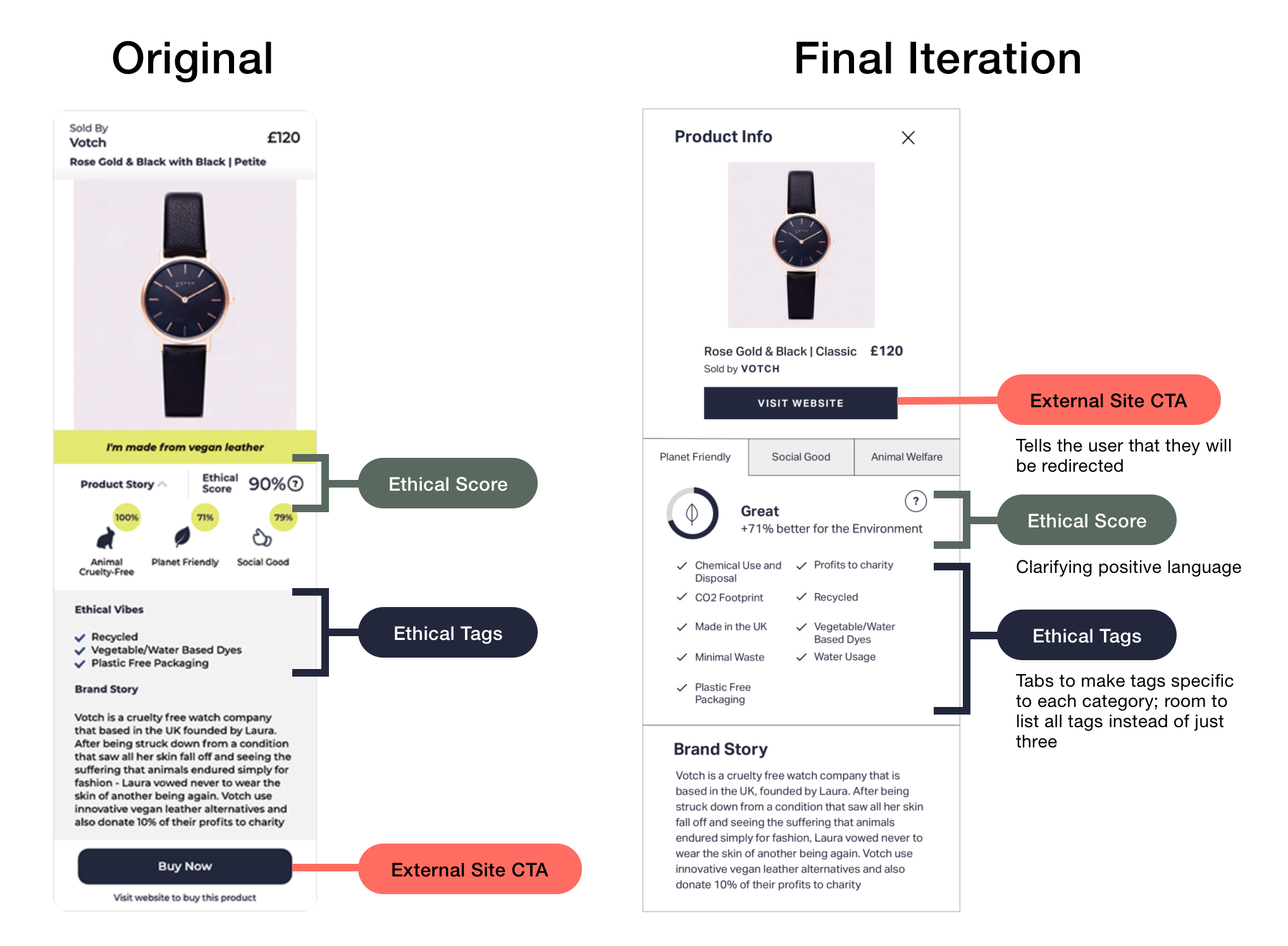
We also adjusted the copy for more clarity:
“Buy product” was changed to “Visit Website”
“Product story” was changed to “Learn More.”
Ethical Score
All products on the Compare Ethics website reached a certain threshold in order to be displayed on the products page.
These products are rated with “ethical scores” based on how many ethical policies they were following. This created confusion with users who thought that low scores meant the product was unethical, when in reality it was significantly more ethical than the average mainstream product.
We associated each score range with increasing degrees of positive language. Lower scores were “good,” medium scores were “great,” and high scores were “excellent.”
We clarified the meaning of the scores with the context of “+__% better for workers/animals/the environment.”
We created more room for the full score breakdown by putting the three categories in interactive tabs.


